In magazines, the layout is obviously a lot different to the online film reviews. In magazines the reviews tended to be a lot more in your face, a lot going on and the idea of the magazine film reviews is to catch the readers eye. Whereas the online film reviews are an easy read, compact and simple. The audience would be of a similar age, but the online film reviews maybe for a reader who is at work and wants to quickly read a latest films review.
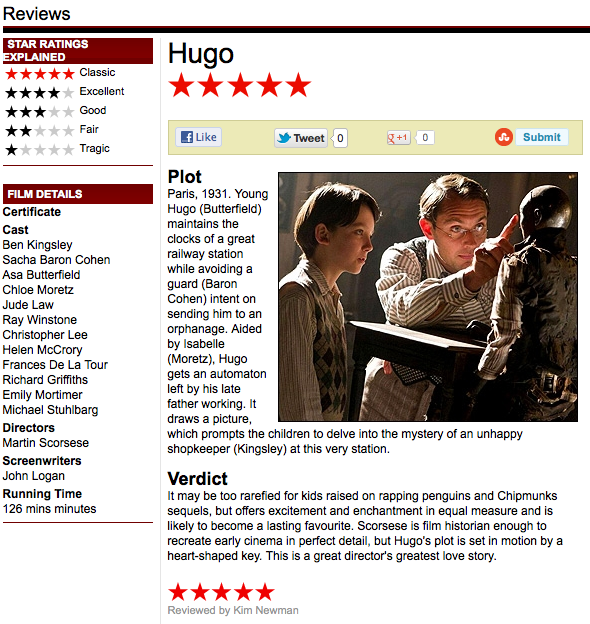 Here is a review of the film 'Hugo' on the Empire website. As you can see everything is kept simple but is still very concise. There is a clear key of what the film has been rated, a few film details about the cast and directors and also a quick summary of the plot and the overall verdict of the film. The review also has an image on the review to still allow the viewer to get an idea of the film. When it comes to designing my film review, I will probably create something similar to a review from a magazine. I'll do this as I want the review to be as much fun to read and view as possible and putting effort into the review will pay off when someone reads it.
No comments:
Post a Comment