Sunday 15 April 2012

Final Products - Film, Poster and Review


Evaluation

In what ways does your media product use, develop or challenge forms and conventions of real media products?


Ever since the start of this new project I have learnt a lot about Film Noir, but also the conventions that come with it and how to achieve these conventions. Especially in our Film Noir, it was important to make it show that we were developing and challenging forms that would appear in either a Film or Neo Noir, that you would watch in the comfort of your own home. 


The first obvious Film Noir convention that was shown in Blackmail was the fact it was in black and white, a typical feature of a Film Noir. Achieving this was fairly simple and was done during the editing process and it simply involved reducing the saturation of the film on Final Cut (Editing program which was used). We also followed the theme of having a femme fatale but challenged the typical femme fatale by leaving it open to who it actually is until the end of the film. Our group felt this would keep the original convention of a femme fatale character but also add more mystery and suspense to the overall mood of the film. Mise-En-Scene was a key element of Blackmail and we definitely had conventions of Film Noir in our own film. Especially the clothing used, smart suits, trilbys, fancy dresses etc. Also using props was a key element to make the Film successful and getting the right equipment was vital to make it appear as near to a real film noir, which was set in the 1950's. 


In most film noirs that I have watched they all feature Venetian blinds, which add that sense of gloom and suspense. Our group felt it was important to have this key convention featured in Blackmail to follow this trend that appears in so many film noirs. 


As you can see from these two screen grabs, it shows the film noir convention that is Venetian blinds, but also the natural lighting that is used for filming can be shown in the above image. The lighting is an important convention of a film noir and is apparent and visible in the majority of well made film noirs, so for our film to be at this level we used natural lighting to our advantage during our filming process.


Camera angles are an important convention in all film noirs, so it was important for our group to capture everything using various camera angles that would be seen in a box office film noir.
We used many different types of shots, including two shots, close ups, extreme close ups, high angle, low angle, point of view etc. 
 Here are two examples of different camera angles and effects which were used in our own film noir. The above image shows a two shot, but also shows off the feature of low key lighting, a convention used in film noirs to create that suspense and excitement. The other image to the left shows a low angle shot, giving off that sense of power to the person shown in the screen shot, a camera angle used a lot in a film noir.


I think Blackmail done very well at developing and challenging forms and conventions of a real film noir. We added our own touches to the film, but kept the simple and traditional conventions through out our own film. 


How effective is the combination of your main product and ancillary texts?


Through out the filming and editing of our film, I had to constantly think about how my film poster and review page for Blackmail would work out. Mainly thinking about the features in the film that could be shown in the poster and review page. I thought about the dark nature of a film noir, and the mystery that comes with the eeriness and mood through out the film and put this across to the poster and review page. Looking at real products such as the film poster for 'Double Indemnity' and 'Brick' helped a lot as it showed the contrast between a typical film noir and the modern noir. I tried portraying this in my own poster and review page, especially the review page as we have the modern technology now to make things look professional. 

When creating the poster I kept in mind the convention of low key lighting in our film noir, and portrayed it through the poster, as you can see in the strong shadows on the characters faces. But I brought through this theme of evil and portrayal using the colour red for the title of the film, especially using the font which appears like newspaper text, it is very key and relates to the theme of the story. When making the film review, I actually used an image taken from the film as I thought this added that touch that made you feel like you were watching the film again, and to remind you of the dark mysterious ways of a film noir. Again I brought through the colour red to create that effect of evil and portrayal.


What have you learned from your audience feedback?


When our film was finished we showed it to our class mates from other media classes and also friends of other students. We shared our opinions on each others films and what we thought was good and bad. Even though when showing our film we had a few technical problems as it was slightly jumpy here and there the overall feedback was very good and our group was pleased with the outcome, and it proved that the hard work did in fact pay off. 


A few things people did mention however was the acting, saying that it could have been done more professionally and overall better executed as some parts weren't very believable. 
Here is the feedback from classmates and friends. We were all very pleased with what came back, and felt that everything went well. I learnt from the feedback that people were a fan of the Venetian blinds scene and also the suspenseful nature of the film as a whole. Although we did have to make a few changes to the final scene of Blackmail because of lack of space in the office we were using, our audiences feedback on this was overall mainly positive which was a relief as our final scene was quite rushed, and could have been dealt with a lot better.  


Overall I have learnt that working hard does pay off as the feedback we received was mostly all positive, and people did enjoy the overall film and conventions that were featured. What I have learnt is that we should also use our time more efficiently as towards the final few days everything was rushed as we didn't have a set plan for filming or editing. 


But overall I am very happy with everyone's opinions on our film noir 


How did you use media technologies in the construction and research, planning and evaluation stages?


Myself and my group used many media technologies throughout the making of our film noir and ancillary products and we had to research and plan through out. 


To research into film noirs I used google and IMDB (internet movie data base). I used IMDB to research specific film/neo noirs and look up information about the cast, directors and running time etc. I used google to search the genre film noir in more detail. This was one of the beginning processes of the making of our film noir, as I needed background knowledge of film/neo noirs, so using google was the best option. 


Some of the technology used for the construction of our film noir and ancillary products included such things as - 

  • Adobe Photoshop CS5 (editing photo's for poster, creating poster and film review)
  • Microsoft Word (screenplay)
  • Final Cut Express (editing and making of our film)
  • Nikon D3000 SLR camera (photoshoot for poster and review. Also taking photo's for locations)
  • Panasonic HDC-SD40 video camera (used to record our film and interviews)
Adobe Photoshop CS5 was a vital program needed for our project to be successful and was used to create our film poster and review. Our group had the task of creating a film poster and review individually but as a group we had to create certain props using Photoshop, such as Clark's office sign, which was used in the office scene for our film Blackmail. Photoshop was very important as well because it allowed me to edit any coloured images to black and white, especially as the main convention of a film noir is the black and white filming. When creating my poster and film review, it was vital to have Photoshop so I was able to convert these coloured photo's to black and white, which could then be used for the final poster and review. 


Microsoft Word was one of the first programs our group used as we designed our screen play on there. We had our screen play written down in rough on paper, but typed it up using Word and added colour font when required to distinguish certain characters, mise-en-scene and locations. 


Final Cut Express was probably the most important program used through out the whole of the project, as without it there would not be a film. We used Final cut to edit our film down, and to make it enjoyable to watch. We would plug the video camera into the back of the iMac with a USB cable and upload all of our footage onto the computer. Once this process was complete we converted all of the footage to Final cut which there it was cut down, given that black and white effect and had sound effects and music added. This program helped out a lot and allowed our film to look like a classic 1950's film noir. Also adding effects to each clip such as 'Vignette', gave the film this 1950's vintage film feel, this got great feedback from our audience, so without Final cut this wouldn't have been possible. 


Nikon D3000 SLR Camera This was used to record location shots for our blogs, which also featured in some of our personal film posters and blogs. The camera was my own, and was simple to use for the whole group. We also used the camera to capture photograph's for our posters and film reviews, we took the photograph's in the school studio, where dramatic lighting was used to create strong shadows. 


Panasonic HDC-SD40 video camera Also another important bit of technology, as without it we wouldn't have been able to record our film. The camera had about 3 hours battery life, and didn't let us down. Whilst filming we would often mount it on a tripod to allow our shots to be more steady and accurate. The HD quality feature on the camera was also a nice feature to the camera as it allowed our film to appear more clear and crisp. It also had enough memory on the camera to hold all of our footage, including all of the mistakes we had. 

Thursday 12 April 2012

Film Review

This is my film review for Blackmail, which was created using Adobe Photoshop CS5. The photograph used on the review was taken at the school office, using a Nikon D3000 SLR camera. The photography was actually taken during the shooting of one of our scenes, so I thought it would be good to use an image from the actual film.

First of all I opened Photoshop and changed the layout of the page to landscape. After this I copied the edited black and white image onto the page and fitted it to about an A4 size, so the other page had an A4 size for writing too. I created a text box in the bottom right hand corner and added text, changed the font size, and simply wrote in the text box 'Film Of The Month'. I done this as it is very typical of a film review page to have something like this on it. Also the red and message will attract attention of the reader.

Next I drew two lines, one landscape way, one portrait to create a box. The box was used to fit in the plot of Blackmail and the verdict of the film. I used two text boxes for the plot and verdict, using different font and font size to differentiate the two texts. I added the title of our film above the Plot, and used a deep red colour which is an on going colour theme used in the Film poster as well. I made up a film review page, and simply called it 'Film Zone'. I feel it's simple and gets to the point, and is relevant to the subject or reviewing films.

Last of all I moved onto adding the features about the cast, directors, certificate, running time and the score using an image of stars. Again I created a text box and used a bold font for the titles of each, and then used normal text to add the names of cast, running time etc. Then the last part to give it that professional look was adding an image of the scoring, by saving an image of some stars from google, I then copied the image onto the page and fitted it just above the film information.

Overall I am very pleased with my film review, and I feel it fits in with the Film noir and Film poster

Researching Film Reviews

Before going straight into designing my film review for Blackmail, I decided to take a look at some film reviews from a few magazines, but also film reviews on certain websites. Some of these websites included Empire, IMDB, Total Film etc.

In magazines, the layout is obviously a lot different to the online film reviews. In magazines the reviews tended to be a lot more in your face, a lot going on and the idea of the magazine film reviews is to catch the readers eye. Whereas the online film reviews are an easy read, compact and simple. The audience would be of a similar age, but the online film reviews maybe for a reader who is at work and wants to quickly read a latest films review.
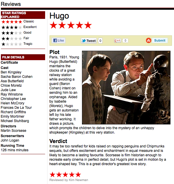
Here is a review of the film 'Hugo' on the Empire website. As you can see everything is kept simple but is still very concise. There is a clear key of what the film has been rated, a few film details about the cast and directors and also a quick summary of the plot and the overall verdict of the film. The review also has an image on the review to still allow the viewer to get an idea of the film. When it comes to designing my film review, I will probably create something similar to a review from a magazine. I'll do this as I want the review to be as much fun to read and view as possible and putting effort into the review will pay off when someone reads it.


Here is a film review of Spider-Man 2 in a magazine. Straight away you can see the difference compared to the online film review. It's a lot more in your face, the image is a central part of the review along with the title. The verdict is clear at the bottom of the page, white on red, which is also relevant to the article as spider man's main colours are white and red. Also the overall colour scheme is relevant to the central image (red,white,blue). This works well and keeps the interest of the reader. The main text is clear and the bolder writing will be important notes about the film. When creating my film review, I will be using a black and white image, and using fonts relevant to the central images and using fonts and texts which match the image.

Blackmail Film Poster

Here is my own personal poster for our groups film noir 'Blackmail'.

Overall I am very happy with the outcome of the poster, and feel it works very nice in relation to our film noir. As I said in a previous post the aim was to create this mysterious and eerie feel, something very typical of a film noir. I also decided to have the poster in black and white to really capture conventions of a typical film noir. But in contrast to the black and white colour scheme I mixed it up with some colours for the text. As you can see I decided to use a sort of newspaper font for the title, which fits in well with our film noir and adds a personal touch. Also the strong, vibrant red for the title adds threat and danger to the poster, making it stand out to the viewer. I added a couple of reviews which were from our personal feedback sheet, I felt this also added a personal touch, as they are real reviews.

To edit the film poster I used Adobe Photoshop CS5. The first step of creating the poster was adding all three posters onto an A4 blank page. Once all three images were on the page, I cropped them slightly and fitted them into each corner. The bottom right corner was left blank white, so I simply used a black paint brush to fill in the area. Once the background was complete I moved onto the text. I used the text box tool on Photoshop and just added the text which was required, adjusted the size and rotated the title slightly.

Creating my Film Noir poster

After looking at a few film noir posters, it was now time for our group to create our own. With the film now all done and edited we had two tasks left which were our film posters and a double page film review of 'Blackmail'. Instead of making a poster and film review for the group, we had to design and make our own.

The first process was using the studio at school to take photograph's for each of our posters. We decided to go for a mysterious and gloomy feel for the shoot, so we used a lot of shadows to create that mood.

Here are some photographs of us in the studio taking photo's for our posters and film reviews. As you can see we are using a Nikon SLR camera for the shoot, and we did end up using a tripod for steadiness, but this isn't shown in this screenshot. Once we had finished taking photograph's we were left with choosing each of our favourite photo's and editing them on Adobe Photoshop CS4/5. 

These three images are the ones I chose to use for my Film Noir poster  - 


 As you can see from the three photograph's they are very dark and show strong shadows. I like the eerie feel that all of them have and I believe will create a very mysterious film poster.

To create this effect all I done was opened all three images on photoshop and converted them to black and white. Next I adjusted the contrast slightly to make the whites and blacks stand out more, especially the shadows in contrast to the skin and hair. Lastly I used the curves tool to balance out the lights and darks in the overall photograph.

Researching Film Noir posters

 For every Film Noir there would be a movie poster created. So before I created the poster for our film, I decided to research and look at a few posters from Film/Neo Noirs that I have watched either in class or in my own time.

 The three film posters I decided to study and look at were 'Brick', 'Double Indemnity' and 'The Big Heat'. These three films are ones I've watched and studied so I thought it would make sense to take a look at the posters that were created for the films. 'Double Indemnity' and 'The Big Heat' are fairly similar as in the structure of the poster and the male is the dominant force in both posters. For example in Double Indemnity the male is seen in control, as he's towering over the lady and is seen with a weapon. And in The Big Heat, the male seems to have power over the woman as he is grasping her wrist. Both characters, male and female are seen to be smartly dressed. Both males wearing a suit and women wearing elegant dresses. Even though the colour of the two dresses are different, this could be a sign of what the character is like in the film. The yellow dress almost suggests a mysterious and neutral role and the red dress is a sign of a typical femme fatale character in a film noir.

 Comparing these two posters to Brick we can see an obvious difference. One being that Brick has used digital imagery to create the poster, mainly because technology is more advanced. But a similar property of the film noir posters compared to the neo noir poster is that all of the posters introduce the main characters in some way or another. The text in all three posters is fairly similar apart from the location of the text. The title of the film is quite bold and central in all three posters and the colours used are strong and stand out. The actors names in Double Indemnity and The Big Heat are clearly written at the top and bottom of both posters, whereas in the film poster for Brick, we are only introduced to the character's names in the film.

When It comes to creating my own poster I will be using Adobe Photoshop CS5, and I will use photo's that me and my group have taken in the studio at school on the poster. For the title, I will make sure it is bold and try to stick to a colour which contrasts well with the background, doing this will make it stand out even more and gain the viewers attention. I may also include a critics review of the film from my audience feedback, doing this will show real thoughts of the film, and also be typical of a film noir poster.